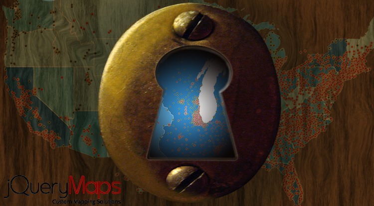
The general consensus for displaying high volume data on a map, being stores, locations, historical data, zip codes, or any other point information, is to color code areas based on the density of information located within. This is a practical way to visually convey the amount of information located within any geographic area without overloading the map with points. However there are times when high-density clustering of markers is desired, both for visual and presentation purposes. The new tool developed by jQueryMaps speaks to this requirement.
 When dealing with high-volume data points, the challenge is to find a balance for how much information to show without overloading the software and over cluttering the map rendering it unusable. The latter can be mitigated by playing with the size of the icons, using tiny dots if necessary, however the first challenge is more significant. Our jQueryMaps software is designed to load information directly in the user’s browser, making it possible for an indefinite number of people to view the map at the same time. The only tasking event on the system, is the external calls made to a database used to retrieve information to plot on the cartography. In the past we have improved performance when displaying hundreds of markers, by indexing queries and carefully parsing the code to improve efficiency and load time. While effective in many instances, these approaches also face limitations with high-volume data points. See example
 A new system design for managing high-volume data is to first load a particular map view and only subsequently refresh the map data. If the filters in the system are updated, say a category is changed or added, the map refreshes the data without needing to load the map again. This allows for the system to respond much more efficiently as can be seen in a custom solution created for RetailNetGroup.
In particular this approach serves as a good model for project that require showing a large amount of data and don’t require for the information to be visible on all levels. For example, the traditional color coding of areas by information density can be activated by default and the icons can be selectively displayed on any level when activated in the filter by a user.
While plot maps and working with high-volume data points are not for all projects, they certainly hold a lot of visual value. The new tool created by jQueryMaps is a great solution for these instances. Contact us if you have any questions about this tool.
Share the post "How HTML5 Maps can Manage High-Volume Data on your Map"


